Is your author website as effective as it can be? Is it really working for you? Is it time for a website tune-up?
To save money and because so many “free” resources are available, many writers build their own websites. I love and believe in the entrepreneurial spirit.
But book marketing is challenging; you can’t do everything yourself; and writers can’t be expected to have all the skills or knowledge they need to create a professional author website.
Here are some website essentials you might not be aware of.
1) Your author website should make a good first impression
Looks count!
Many studies have shown that website visitors make their decisions about whether to stay or leave a site in a manner of seconds. Yes, seconds. In fact, a website must communicate its value to the visitor in ten seconds. Even a good site may only get a few minutes of attention.
Is your website aesthetically pleasing? Is the design clean and modern-looking or full of visual clutter and walls of text? Does the design enhance—or detract from—your message? Is it immediately clear who you are, what you’re about, and what you want visitors to do on your site? Is your content useful, engaging, and well organized?
Just like you need fresh eye to critique or edit your novel, ask other people to give you an honest appraisal of your website.
2) Your author website should be mobile-friendly
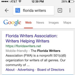
Last month, Google changed its algorithms to favor mobile-friendly websites in search results. More and more people are using their smartphone to search for information. According to a study by comscore, mobile-only adult Internet users exceeded the number of desktop-only internet users this year.
Since Google searches favor websites that it defines as “mobile-friendly, if your site is not mobile-friendly according to them, you may experience a decline in the number of visitors. Test your site here.
3) Your author website should help you build a mailing list
An opt-in form to capture visitor email addresses and build a permission-based mailing list should appear prominently on your site.
Many authors have virtually abandoned their websites in favor of building lists of followers on social media. That’s risky, because you can never control what Facebook or any other social media site does with its interface and functions—or your followers. Facebook wants Page owners pay for reach. And when the social media site where you’ve put all your eggs loses popularity, you’ll have to start from scratch to rebuild your presence somewhere else.
Unlike social media, you always have total control over your website—and your mailing list—and you can make them stronger and better over time.
It’s never too early or too late to build a mailing list. If you do not have an opt-in form to capture e-mail addresses and allow people to subscribe to your content, you’re missing out on a great opportunity to connect with potential book buyers and supporters.
If you subscribe to updates to this Florida Writers Association blog, what you receive is a newsletter auto-magically generated when a new post appears on the site. If you have a WordPress (WP) site, it has a mechanism to set this up easily, but WP doesn’t allow you to access subscriber data or change the design of their very generic looking mailer.
I recommend using a service like MailChimp which allows you to build a mailing list, customize your template with your own branding, and provides analytics you can use to judge the effectiveness and fine-tune your content. Once designed and set to go, your newsletter will auto-magically appear in your subscribers’ email boxes. You can use your blog posts to inform subscribers about your books and events as well as keep them engaged with regular informative or entertaining posts.
—
A website is key to your marketing plan. A great website doesn’t have to break your budget, but it is an important investment in your future as an author.

Robin Ingle
Mary Ann, thanks for this informative post. The part about mobile-friendly sites is so true. Many writers who are blogging for the first time don’t realize that many of the newer WordPress themes come with “mobile friendliness” built in, which allows a writer to not have to worry too much about designing for mobile users (and in fact, in my experience, many writers are completely unaware that they have or don’t have a mobile-friendly site). If you choose your theme carefully, a lot of headaches can be avoided. Thanks again for a great post.
Mary Ann de Stefano
Good points, Robin! Thanks for reading and commenting.