
 Did you ever wonder why a lot of author sites have a mailing list sign-up form at the top of the home page? Were you ever curious as to why some sites like Mark Dawson have only the sign-up form on the home page, and nothing else?
The short answer is pretty simple: they want to maximize mailing list sign-ups.
The long answer, however, is a little more complicated. This post will explain how to optimize your site to get people to sign up for your mailing list. (It will also go a little off topic from the focus of this blog post series to explain the relevant principles of web design, but that is worth your time because the info is useful in and of itself.)
Caveats
But first, I think I should start with a few caveats.
One: Installing sign-up forms on a website requires a fair degree of technical knowledge.
If you have a WordPress.org site, you can save a lot of time and effort by installing a plugin, but if your site is hosted on:
- WordPress.com,
- Squarespace, or
- another hosting service
it might take you some time to figure out how to embed a sign-up form, and then connect that form to the service you use to send out newsletters.
Two: While I think that it is important to set up your site to encourage people to sign up for your mailing list, I also know that most authors will not get very many visitors coming to their site.
This is why, if you want people to sign up for your newsletter, you should also learn how to do Facebook ads. (I don’t know this yet, which is why FB ads are not the topic of this post.)
Three: I wrote this post with the Mailmunch service in mind.
Mailmunch does not have great tools for formatting and sending newsletters, but it does have a free service tier with feature-rich forms that you can connect to other mailing list services such as:
- Mailerlite
- Mailchimp
- Constant Contact
For example, I use Mailmunch to build the sign-up forms on many of all the sites I build, including my own sites. (I send out my newsletters with Mailerlite.)
Four: Try not to be annoying.
Your website visitors will get annoyed if their reading is interrupted by several forms all at once. Many will leave your site cursing your name, never to return.
So when you start installing sign-up forms on your site, be deliberate in where you put the forms so that visitors don’t see multiple forms at once. If possible, set each form so it will not reappear for a month. (Mailmunch has this option, but not all forms will.) Also, ask your friends and fans for feedback; have them test your site and tell you if the forms are a nuisance.
Oh, and one final note: I feel that I should explain the difference between a mailing list and a newsletter. A mailing list is the list of email addresses belonging to subscribers. A newsletter is an example of the content you might send out to the mailing list.
I tend to use these two terms interchangeably, which is a mistake, but the reason I am bringing this up is to make a point: While I don’t think you have to send out newsletters to your mailing list, I do think you should start growing that list today. This will give you the option of sending newsletters later.
Sign-Up Forms
If you want to maximize newsletter sign-ups on your website, you should have four different types of sign-up forms:
- the landing page,
- the top bar,
- the pop-up, and
- the home page
The Landing Page
I am going to write a post explaining in detail how you should lay out and write the content on a landing page, so I won’t repeat it here. But I will remind you that you should be sure to put links to that landing page in:
- the back of your books,
- your profile at GoodReads,
- your author profile on Amazon,
- Your email signature,
- The author bio on guest blog posts, and
- just about anywhere else you can think of.
The Top Bar
This is a nickname I gave to the sign-up forms you sometimes see as a bar across the top or bottom of a web page. This form is usually inserted by a plugin or via a script, and can look like a simple bar or as a more attention-grabbing pop-up.
Here’s what the topbar looks like on my blog, The Digital Reader:
![]()
And here’s what the topbar looks like on Joanna Penn’s The Creative Penn:

This form might not look like much, but I will let you in on a secret: On my site, the top bar form actually gets as many sign-ups as the pop-up form. It is well worth the few minutes it takes to set up.
The Pop-Up
Pop-ups, those little windows that suddenly appear over the content while you are browsing a site, are simultaneously the most hated part of the internet and also a highly effective way to get people’s attention. Many sites use pop-ups, or rather they misuse pop-ups to the degree that a lot of people hate the very sight of them.
Pop-ups can range from a simple rectangular form shown in the middle of the screen to a full-screen “Stop what you’re doing and pay attention to me because I’m important!” malevolence. (Here’s a tip: Don’t use the big pop-ups).
I don’t use a pop-up any more, but when I did I had a relatively simple pop-up on my site:
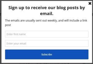
In spite of their bad reputation, pop-ups are still a great way to increase your newsletter sign-ups — you just need to take care not to annoy your visitors.
The trick is to set the pop-up to only appear every so often, and only when the visitor is about to leave your site. This is what is called an “exit intent” pop-up, and I learned of it from Jane Friedman. Several years back she wrote a blog post that shows how to use the Mailmunch plugin on WordPress sites to create pop-up sign-up forms that will not annoy visitors.
You should read her post, and if you have a WordPress.org site you should install the Mailmunch plugin and follow her instructions.
If you do not have a WordPress.org site, you can (in most cases) still use the Mailmunch forms. You will just need to:
- set up an account on Mailmunch’s website,
- build your pop-up forms there, and
- copy the code for the forms to your site
By the way, if you have a WordPress.com site, you can’t use the Mailmunch forms — unless you are on the business plan, which costs $25 per month. That is one of the more frustrating limitations of the WordPress.com platform, but the platform still has its benefits.
The Home Page
The top of your website’s home page is the very first thing that your visitors see when they come to your site. It is the single most valuable real estate on the entire site, which is why web designers spend hours if not days helping clients decide how to get the most value out of that first impression.
You are probably thinking you should add a mailing list sign-up form at the top of the home page. That is not a bad idea, and it’s what I put at the top of my home page, but I have a better suggestion.
Instead of automatically putting a mailing list sign-up form at the top of the home page, you should ask yourself this question:
What one act do you most want your visitors to do when they visit your site?
That one act decides what you put at the top of your home page.
The answer will vary between authors, so I can’t give you an absolute rule for what you will put there, although I can say that if you answered my question with “buy my books”, you are being too optimistic. For the most part you need to form a relationship with visitors before you can get them interested in your books.
That relationship with readers is why many authors ask visitors to sign up for the author’s mailing list.
So what do you put there?
What I like to do when building an author site is:
- use the top of the home page to introduce the author
- use imagery and text to make it clear what genres the author writes
- then invite the visitor to sign up for the author’s newsletter in exchange for a lead magnet
If you want an example of a home page that hits it out of the park, check out Mark Dawson’s site. The background makes it clear he writes thrillers set in the UK, and you are prompted to sign up for his mailing list. (It’s also gorgeous, which is actually the least important aspect.)

This might not work for you, but from a design and marketing viewpoint, it is just about perfect.
So tell me, what will you put at the top of your home page? Will it be a mailing list sign-up?